Executive Summary
This is the first in a series of papers that seeks to explore why U.S. profit margins have remained elevated for the last 10 or so years compared to history. I look back to a paper written just over a decade ago in which I predicted a return to normal profit margins. I obviously couldn’t have been more wrong. In this paper I return to the framework of the Kalecki Profits equation to understand the macro source of my error.
It transpires that fiscal deficits have been the culprit. Between 1950 and 2011, the fiscal deficit averaged just less than 3% of GNP each year. In the period from 2012 to 2022, the fiscal deficit was more than double the previous average, at 6.6%. This isn’t just the impact of the pandemic: the same basic pattern holds even when I exclude the Covid years! The main sources of the increased deficit have been health spending and social security expenditure (again true even with Covid data excluded). Is this era of what Minsky would have called “Big Government” here to stay? That is beyond my ken, and I am chastened by my failed prognostication over the last decade.
However, even if I take a very bullish view, that this is indeed a new era of permanent deficits and thus profit margins will remain elevated relative to history, I still cannot find any valuation attraction in U.S. equities in aggregate. The Shiller P/E naturally embodies the decade of higher-than-normal profit margins and yet still stands at 30x. Even without any valuation or margin mean reversion, this dooms investors to low returns in the long run. Any moves toward either valuation or profit margin reversion make this return even worse. Measures of margin-adjusted CAPE show the U.S. to be trading on 45x to 50x! Either way, the aggregate U.S. market looks to be priced for something beyond perfection. There simply isn’t a margin of safety.
The good news is that other markets look considerably more attractive than the U.S. Emerging Markets, Europe, and Japan all offer much better expected returns than the U.S. If one is willing to dig a little deeper, then Value within these markets (and even Deep Value within the U.S.) looks like the best hope for generating decent returns. For instance, Value within Emerging Markets is trading on around 7x Shiller P/E…talk about discounting the bad news!
One of the great luxuries of longevity in this business is the ability to look back and learn from our mistakes. What did we miss? What can we do better? What should we learn? Personally, I have confessed to some of my howlers over the years. One such example was my disastrous statement sometime in 1997 that Japanese bonds yields could not possibly go any lower – uttered just in time to watch the yields halve and then halve and halve again over the next 20 years! Or my unfortunate habit of being too early – usually a good two years too early – in calling the tops of markets. And, as we all know, in the short term there is no difference between being early and being wrong.
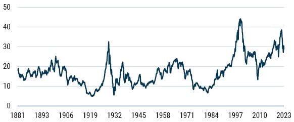
However, in this missive I want to return to a paper I wrote in March 2012, entitled “What Goes Up, Must Come Down.” The subject of that paper was U.S. profit margins, and why they were unlikely to maintain their “nosebleed” levels.
As Exhibit 1 shows, I couldn’t have been more wrong. Mea culpa, mea maxima culpa, mama mia culpa! On the plus side, margins did indeed come down from their levels at the time of writing (at least for a while) but they never returned to “normal,” and the decade average of 9.5% far exceeded the long-term (1950 to 2012) average of 6.3%.
EXHIBIT 1: U.S. NIPA PROFIT MARGINS (% of GNP)
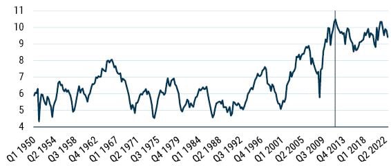
As of April 2023 | Source: BEA
Before I delve into what I got wrong, it is worth pointing out that there is a close relationship between the profitability as measured by NIPA (National Income Product and Accounts, which is the framework I will be using) and the measures reported by companies under GAAP (albeit with GAAP being more volatile than NIPA; see Exhibit 2). This allows us to use the macro profits framework, which I will lay out below to help us understand what has been going on.
EXHIBIT 2: NIPA vs. GAAP PROFIT MARGINS – U.S
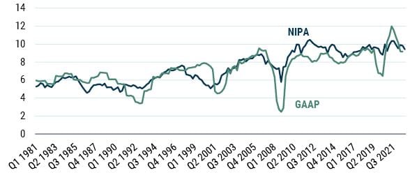
As of April 2023 | Source: Datastream, BEA
Where did I go wrong?
So, what gives? What did I miss? Let’s start by looking at the framework I used back in 2012 to understand what was going on with profits – the Kalecki Profits equation. This framework can be derived from national accounts identities. (I will omit the details here, but they are available in the original 2012 paper for anyone unfamiliar with the concepts.)
The final equation is:
Profits = Net Investment + Dividends – Household Savings – Government Savings – Foreign Savings
The following was the explanation I gave in 2012 and it still stands today: Let’s briefly examine the logic behind these drivers of profits. Investment (technically, investment net of depreciation) drives profits because when a firm or a household decides to invest in some real asset, they are effectively buying the good from another firm, creating profits for that entity. Remember that this is aggregate; any single firm (even the world’s largest) is minuscule relative to the total amount of investment that occurs, so it isn’t possible for any given firm to bootstrap itself into profit via investment.
Household savings are a drag on profits. This should be fairly obvious. Wages are paid by corporates to households, creating income from the household perspective. If some of this is saved, it is clearly not recycled into spending and, hence, is lost from the corporates’ profits point of view.
Just like the household sector, government sector savings are a drag on profits. There are many transmission mechanisms between the government sector and the business sector, some reducing profits, some increasing profits. There is the tax route, whereby personal income tax reduces the amount of profits available to the business sector. Conversely, the government is also an employer, paying its employees who in turn spend and create profits. Plus, of course, there is direct interaction between the government sector and the business sector when the government is buying goods and services. All of these interactions (plus others) can be summarized into government sector savings.
Foreign savings (also known as the current account balance) are also a drag on profits. Remember that the current account balance measures the amount the U.S. owes to the rest of the world (in terms of both actual goods and services purchased and investment flows) minus the amount the rest of the world owes to the U.S. (again in terms of payments for goods and services and investment flows). If the U.S. is running a current account deficit, then it owes the rest of the world, and this is lost potential profits from the perspective of the domestic business sector.
Finally, we have dividends. This may seem like a counterintuitive source of profits since these are paid out by the business sector to households. However, from the perspective of the household sector, these are a form of income, which can be spent, thereby creating profits for the business sector.
Having set this out, I then showed an exhibit of the macro drivers of profits over time, today updated in Exhibit 3.
EXHIBIT 3: THE MACRO DRIVERS OF U.S. PROFIT MARGINS (% of GNP)
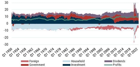
As of April 2023 | Source: BEA
As I opined in 2012, “Even a cursory glance at the exhibit reveals that net investment has generally been the biggest driver of corporate profitability over time. However, the stand-out engine of corporate profits of late has been the fiscal deficit.”
Where I went truly wrong was in the fateful statement that “it is almost unthinkable that it [the fiscal deficit] will remain at current levels over the course of the next few years.” In retrospect this appears to have been a failure of my imagination. To make this even clearer, consider Table 1.
TABLE 1: BREAKDOWN OF PROFITS (as % of GNP)
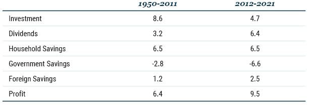
Source: BEA
Note: Columns don’t sum to profits due to the statistical discrepancy. This results from two independent estimations: one based on final expenditures (GNP) and the other as the cost incurred and incomes earned (gross national income); the reconciling element is known as the statistical discrepancy.
A deeper dive into the macro drivers of profits
Let’s consider the first two elements of the table, investment and dividends. I view these as a combined element reflecting corporate choices over financing and distribution. In essence firms can either invest their income or distribute it to the owners. As Exhibit 4 shows, we have witnessed a massive shift from investment to dividends. I am tempted to say this shift reflects increasing monopoly power by corporates (which is generally held to lower investment) and the rising dividends are a form of rent extraction, a topic I will return to in a future paper in this series. However, I am sure alternative explanations exist as well. The bottom line from the profits equation point of view is that it really doesn’t matter: the combined total from the two elements has hardly changed – averaging 11.7% from 1950 to 2012, and 11.1% thereafter.
EXHIBIT 4: NET INVESTMENT AND DIVIDENDS (% of GNP)
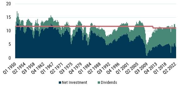
As of April 2023 | Source: BEA
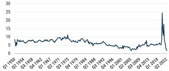
Household savings are identical in the two sample periods in Table 1 (by sheer happenstance, perhaps testament to the flaw of averages). For a long time – 1950 to 1980 – household savings were pretty constant. Then a marked downward trend was established until shortly before the GFC. In the wake of the GFC, household savings returned to something a little more like normal, until the arrival of Covid, when savings skyrocketed. And now, during the recovery, savings have collapsed to near all-time lows (see Exhibit 5). Given these wild gyrations of late, we will have to wait and see where household savings settle (if indeed they do). However, given their albeit coincidental equality in the two samples, household savings were clearly not the source of my error.
EXHIBIT 5: U.S. HOUSEHOLD SAVINGS (% of GNP)
As of April 2023 | Source: BEA
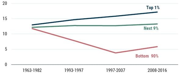
It is worth noting that despite the averages being equal, the underlying dynamics of savings are very different. This doesn’t matter from a Kalecki equation point of view, but it is important in understanding the nature of U.S. economic evolution (yet another subject I will tackle later in this series). For now we simply present the differential savings behavior (expressed here as a percent of income) for the top 1%, the next 9%, and the bottom 90%. The estimates come from a recent paper 1 by Mian, Straub, and Sufi. We have scaled the data to match the household savings data in order to make for an easy comparison. In essence, we see that in the early sample the savings rates were more evenly distributed. However, over the course of the 1990s onwards we have witnessed increased savings rates from those at the very top of the income chain, and significant declines in the savings rates for the vast majority. This is unlikely to lead to a sustainable outcome and might possibly increase economic fragility, but more on this topic in time.
EXHIBIT 6: U.S. PERSONAL SAVINGS RATES (% OF INCOME)
As of April 2023 | Source: Mian et al., GMO
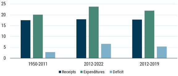
All of which brings us to the source of my error, the fiscal deficit. Simply put, the fiscal deficit stayed much larger than I was expecting back in 2012. As Exhibit 3 shows, between 1950 and 2011 the fiscal deficit averaged just shy of 3% of GDP. In the last 10 years it has averaged more than double this level (6.6%). And this rise was not the sole result of the measures introduced to deal with the pandemic. Looking only between 2012 and 2019, the fiscal deficit averaged nearly 5.5% p.a.
Interestingly, the source of the increased deficits wasn’t a shortfall in revenues (which was my prior thesis; yep, wrong again), but rather an increase in spending – again, an observation that holds true even if we exclude the pandemic period (witness Exhibit 7). Of course, this raises the question as to what was behind the rise in spending.
EXHIBIT 7: CURRENT EXPENDITURES/RECEIPTS AND THE FISCAL DEFICIT (% of GNP)
As of April 2023 | Source: FRED
Has Minsky’s Era of Big Government Arrived?
As Exhibit 8 shows, when we compare the two sample periods the sources of the increase in government expenditure are health, Medicare, income security, and Social Security. Once again this holds true even if we exclude the pandemic period (although income security plays a smaller role, as one might expect).
EXHIBIT 8: SOURCES OF GOVERNMENT EXPENDITURE INCREASE (% of GNP)
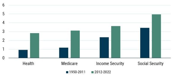
As of April 2023 | Source: OMB
The irony of increased fiscal expenditure being the source of the rise in profits is not lost on me. I have argued in the past that fiscal policy should have a much more active role to play in stabilizing the economy (see “Market Macro Myths: Debts, Deficits and Delusions,” Jan 2016). Indeed, no less than Hyman Minsky (another of my economic heroes, and fellow fan of Kalecki) argued that what he called “Big Government” was a prerequisite for stabilizing an inherently unstable system. Indeed, in 1986 he wrote:
Big Government must be big enough to ensure that swings in private investment lead to sufficient offsetting swings in the Government’s deficit so that profits are stabilized. This means that Government must be of the same order of magnitude as or larger than investment.
Minsky proposed a “job guarantee” model for his favored approach to the way in which the government should interact with the economy, which is very different from the way that we currently observe (again, a discussion for another day). Regardless, I think Minsky would certainly recognize the current levels of expenditure as Big Government.
Before moving onto the next section of this paper, I’d like to address the one offsetting factor in Table 1: foreign savings. The average U.S. current account deficit has roughly doubled between the two sample periods (from 1.2% to 2.5% of GNP). This represents an increased drag on profits. Although it should be noted that the profit shifting in which many U.S. companies engage (booking profits in low tax havens/affiliates) may make this deficit look worse than it actually is (more on this in the next paper in this series). However, this increased drag is largely offset by a significant increase in the statistical discrepancy alluded to in the note to Table 1. Certainly, foreign savings wasn’t the source of my error.
The Profits Prognosis
So, what does all this mean? Well, if the era of big government is here to stay then profits as a percent of GNP can remain higher than they were in the past. As to the likelihood of this…as I have so aptly proved over the last decade, this is simply beyond my ken.
However, it should be noted that economic theory offers no reason as to why profit margins should mean revert. It is the return on capital, not the return on sales, that “should” mean revert. Of course, because capital is not observable, we are forced to proxy it. Indeed, that is exactly what we do when we build our 7-Year Asset Class Return Forecasts. The sales-based measure is just a small component of the wide variety of capital proxy measures we use to construct, and give us comfort around, our forecasts.
From a simple profit margins perspective, we can examine the Shiller P/E. This measure attempts to smooth out the cyclical elements of profitability by following Ben Graham’s advice to use 10 years of earnings in the denominator of the P/E. This makes it interesting to us in the current context as it automatically builds in the fact that profitability has been higher over the last 10 years.
So even if one believes that fiscal deficits are here to stay and that profitability is structurally higher as a result, the U.S. market is still trading at around 30x (Exhibit 9). This dooms investors to low long-run returns. Even if we don’t get any valuation or margin mean reversion, investors are facing a return of around 3% real – hardly likely to be sufficient recompense for the risk of owning equities.
EXHIBIT 9: SHILLER P/E
As of April 2023 | Source: Shiller
Of course, if we get valuation mean reversion, then investors will face long-run returns significantly worse than 3% real, even if margins don’t mean revert. For instance, if the CAPE were to drop to 20x (way above the historical average) over the course of the next 7 years, this would create a return drag of 5.8% p.a.
In the past both John Hussman and I 2 have shown that various measures of margin-adjusted CAPE have performed better than standard CAPE as predictors of returns – naturally due to the mean reversion of margins over time. These kinds of measures are shown in Exhibit 10. They show how if margins were to revert to their “normal/historical levels,” then the CAPE would be much higher than the standard CAPE shows – margin-adjusted measures of CAPE are around 45x to 50x today! If you believe in full reversion of both valuations and margins, then your return outlook would be exceptionally downbeat.
EXHIBIT 10: MEASURES OF MARGIN-ADJUSTED CAPE
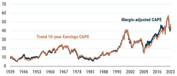
As of April 2023 | Source: GMO
As I confessed above, I don’t know if profit margins will mean revert. The many moving parts of the Kalecki equation have a way of confounding the daring prognosticator, and much depends upon the path of the fiscal deficit in the coming years.
However, even on the most bullish case, that of no mean reversion in valuations or margins, investors look set to earn a fraction of the compensation that has historically been demanded for the risk of owning equities. I don’t see any evidence that investors have “rationally” adopted a new lower expected return for equities. Ergo, I remain highly skeptical of the current pricing of the U.S. equity market.
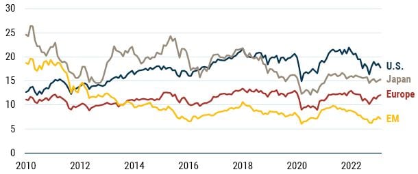
The good news is that many other markets around the world are considerably more attractively priced. Exhibit 11 shows the way in which the U.S. stands out in valuation terms. At the other end of the spectrum are the shunned Emerging Markets trading on a Shiller P/E barely in the double digits! These kinds of levels of valuation offer a very wide margin of safety to the investor.
EXHIBIT 11: CAPES AROUND THE WORLD
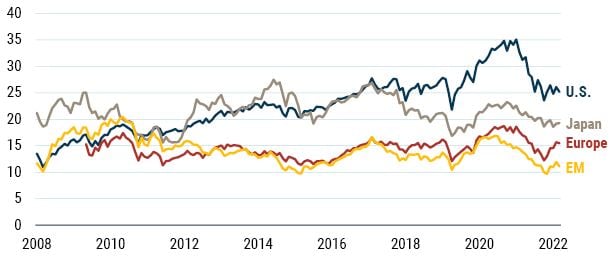
As of April 2023 | Source: Bloomberg, GMO
If one is willing to go deeper into the equity markets even more protection is available. As my colleague Ben Inker has written about many times over the last 18 months, Value around the world continues to look attractive even in the U.S. market, especially within the Deep Value cohort (roughly cheapest 20%). So, if you must own the U.S., then for the love of all that is good, please own the cheap stuff!
EXHIBIT 12: SPOT P/E: U.S. VALUE VS. GROWTH
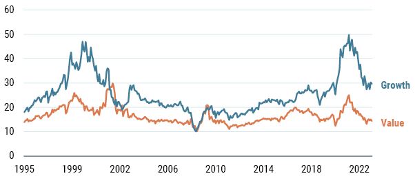
As of April 2023 | Source: Bloomberg, GMO
This pattern of Value looking attractive holds true in other markets around the world as well. Once again, for the deep bargain hunter Emerging Markets Value trading on 7x 10-year average real earnings looks like a wonderful opportunity. European Value at around 12.5x and Japanese Value at 15x also look very enticing to anyone with an eye for the cheap. Despite my skepticism of the U.S. equity market, the opportunities available outside the U.S. continue to look attractive.
EXHIBIT 13: SHILLER P/E FOR VALUE AROUND THE WORLD
As of April 2023 | Source: Bloomberg, GMO
Download article here.
Hussman uses a margin-adjusted CAPE, where the standard CAPE is multiplied by the ratio of 10-year average margins to long-run margin. I have used a measure based on trend 10-year earnings. Both approaches yield very similar results.
Disclaimer: The views expressed are the views of James Montier through the period ending May 2023, and are subject to change at any time based on market and other conditions. This is not an offer or solicitation for the purchase or sale of any security and should not be construed as such. References to specific securities and issuers are for illustrative purposes only and are not intended to be, and should not be interpreted as, recommendations to purchase or sell such securities.
Copyright © 2023 by GMO LLC. All rights reserved.
Hussman uses a margin-adjusted CAPE, where the standard CAPE is multiplied by the ratio of 10-year average margins to long-run margin. I have used a measure based on trend 10-year earnings. Both approaches yield very similar results.