This research is related to the newly launched Nebo platform, a portfolio construction tool that helps RIAs build better portfolios. Nebo bridges the gap between financial planning and asset management, and recently won the WealthManagement.com 2022 Industry Disruptor award.
Learn more about Nebo >
Executive Summary
Standard financial industry practice builds retirement portfolios using mean variance optimization and validates them using Monte Carlo simulations that assume asset returns are a random walk. To put a finer, more brutal, point on it, managers construct portfolios using anachronistic technology from 1952 and then have the temerity to check the results using assumptions from 1970. The unsurprising result of a process stuck over 50 years in the past is portfolios that burden future retirees with an unnecessarily high risk of financial ruin.
However, in contrast to the oft heard “TINA defense,” 1 there is an alternative: we suggest a more modern portfolio construction approach that puts the key problem of having sufficient assets to support investors’ required spending in retirement front and center. We believe an approach to retirement investing that better models and understands the ways in which financial markets differ from the outdated academic assumptions of market efficiency and random walks will result in substantially superior portfolios.
Framing and aligning the portfolio construction process with the actual problem an investor is attempting to solve (as opposed to some willow-the-wisp time-varying coefficient of risk aversion) also helps to avoid the troublesome guesswork as to how a client’s portfolio should change if needs and circumstances or, indeed, market conditions, shift from the advisor’s original assumptions.
If you don’t have orange and brown shag carpets or an avocado green bathroom suite or wear bell-bottom jeans or sport pork chop sideburns, why on Earth would you choose to believe that a random walk is a good description of the reality of asset returns? Similarly, the unclear (and unhelpful) framing of a coefficient of risk aversion is far from client friendly. It is high time financial planners stopped being “the slaves of some defunct economist” (to borrow Keynes’ words) and instead joined the 21st century. We propose that planners adopt a needs-based approach coupled with an up-to-date understanding of the way in which portfolio returns are generated.
Introduction
If the financial planning industry had an anthem, it would probably be “Let’s Do the Time Warp Again” from the Rocky Horror Picture Show (thank us when that tune plays randomly in your head). By using mean variance analysis and Monte Carlo simulations that assume a random walk, many planners are (perhaps implicitly) adopting a portfolio construction technology from the 1950s and combining it with a world view that passed as conventional wisdom in the 1970s. The usual rationale for this approach is either that everyone else is doing it or that it has always been done this way. Neither of these excuses is valid or, frankly, laden with intellectual vigor. For the sake of their clients, it is high time financial planners updated their beliefs, assumptions, and processes.
Questioning Your (Hidden) Assumptions: Why Your Monte Carlo Is Wrong!
All too often assumptions lie in the background, driving results but unquestioned or even hidden from view. In the best case, assumptions made are a reasonable approximation to reality or, even better, aren’t driving the results. In the worst case, they may be widely at odds with reality and small perturbations can lead to wildly differing outcomes.
In the field of retirement planning, the problem of assumptions and their impact is particularly pervasive and potentially pernicious. At what age will you retire or die? How much income will you need? These questions highlight the vital role time horizon plays. Unfortunately, conventional approaches to dealing with these issues are based on single-period analysis. This is an odd marriage of multi-horizon problems with single-period “solutions.” It is little wonder that this pairing often produces sterile offspring.
We will show these assumptions have a meaningful impact on retirement portfolios, even under equilibrium forecasts. As an example, assuming asset prices follow a random walk 2 leads to bond-heavy portfolios, causing negative impacts on long-term outcomes in a world in which expected returns vary over time.
Some will try to blind and baffle you with pseudo-science by saying something along the lines of “We use Monte Carlo simulations to help determine the best portfolio or test the viability of your plan.” However, this is really not addressing the issue. It is akin to saying you took a touted performance car for a test drive but failed to check out what was under the hood. Ultimately, when it comes to investing you need to ask about the “deep structure” of the return generation process. Are returns driven by a random walk or a process driven by mean reversion? Only by specifying a sensible empirically consistent model for the return generation process can Monte Carlo simulations be of any real use or relevance. Of course, if your assumptions are at odds with reality, you run the risk of reaching dangerously incorrect conclusions with potentially disastrous consequences.
It is well known that if asset prices follow a random walk, then mean variance optimization generates portfolios that do not depend on the horizon of the investor. However, if expected returns vary over time, then this is no longer the case and portfolios depend critically on the horizon of the investor. 3 4
The choice you make for your assumption of the “deep structure” (or return-generating process) can radically alter the outcomes generated. So, how do you go about choosing a deep structure?
As ever, looking at the evidence is a pretty good place to start. At a minimum, you want whatever deep structure you choose to at least be consistent with the empirical evidence. In terms of modelling your asset return streams, this amounts to examining whether returns are mean reverting or more akin to a random walk. But simply replicating the statistical properties of a series is not enough. Rather, understanding the economic intuition and mechanisms behind the empirics are essential in generating greater confidence and comfort in capturing the return generating process.
Signatures of Random Walks vs. Mean Reversion
However, before we turn to the empirics, we ought to outline how we will examine the issue of random walks versus mean reversion. There are many ways to think about this topic, but the one we have chosen as most apposite for our purposes with respect to retirement planning is the variance plot. This measure makes sense to us because it captures the essence of one important aspect of modelling asset return streams: the uncertainty around the outcome. (N.B. We aren’t using volatility or variance as a measure of risk. As we discuss later in the context of our approach to retirement planning, risk is best thought of as not having enough capital when you need it. However, the range of likely outcomes that any given asset can generate is going to be of interest when it comes to the modelling of the assets you own, especially how this uncertainty evolves over time.)
In the random walk scenario, changes in the series have no memory. An implication of this “no memory” characteristic is that the variance of multi-period returns scale linearly with the horizon of returns, e.g., two-period variance is simply twice the one-period variance.
In contrast, if a series has a tendency to mean revert, then its multi-period variance will scale less quickly than the one-period variance multiplied by horizon, as the series will tend to return to its long-run value over time.
In Exhibit 1 we show the volatility profiles of two series we created. One is constructed to be a random walk, the other to be a mean-reverting series. From the time series plot alone it is obviously very hard to tell these two series apart. However, the second chart in the exhibit shows how the volatility (the standard deviation, or square root of the variance) evolves as the time horizon (or holding period) is altered. As you can see from the plot, the random walk series has a volatility profile that scales with the square root of time (because the variance scales linearly with time) and the mean-reverting series has a volatility that scales less rapidly than the random walk.
EXHIBIT 1: GENERATED SERIES AND THEIR VARIANCE PROFILES
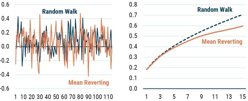
Source: GMO
Referring to the chart to the right, the solid line is the volatility (i.e., standard deviation) of the mean-reverting series in the chart to the left as a function of return horizon. The dashed line is calculated by taking the 1-year return volatility and multiplying it by the square root of the return horizon. Horizontal axis is return horizon in years.
The Empirical Evidence I – Stock Returns Mean Revert
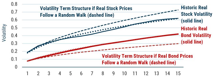
Having introduced the way in which we will be looking at mean reversion, we can now move from the toy series to real world data. Exhibit 2 does exactly that. Here we are plotting the realized real stock and bond return volatility across time horizons, as well as the lines we would expect to see if the returns were generated by a random walk.
EXHIBIT 2: Volatility Of the real return on stocks and bonds as a function of return horizon
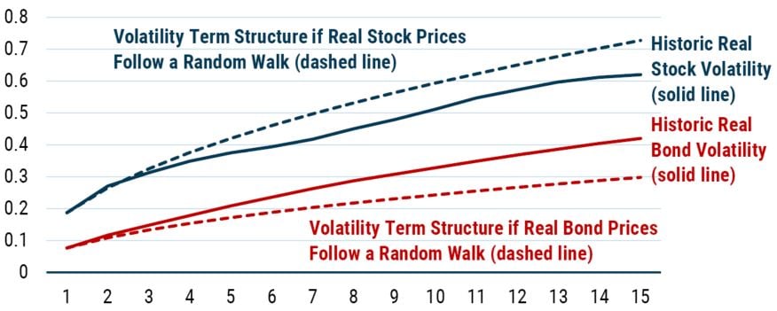
Data from 1926-2019 | Source: Online Data - Robert Shiller (yale.edu)
Solid lines are calculated using historical returns (i.e., volatility for a 5-year horizon is the standard deviation of all 5-year returns, including overlapping returns). Dashed lines are calculated by taking the 1-year return volatility and multiplying it by the square root of the return horizon. Horizontal axis is return horizon in years.
As is clear from even the most cursory of glances at Exhibit 2, neither of the two series we are interested in can be well described by a random walk. This isn’t a surprise to us given the way we tend to think at GMO, but it flies in the face of the oft assumed view typified by Burton Malkiel’s A Random Walk Down Wall Street.
The key problem with the random walk hypothesis from our perspective is that it ignores the role of valuations, which create time-varying returns. The basic proposition of random walk adherents is that a positive real return is generated in the long run (from owning stocks, say), but that the expected return at any given time is the same. That is to say prospective returns don’t increase when the market falls or decline when it rises. This valuation indifference seems very peculiar to us.
The Mechanics of Real Stock Return Mean Reversion
Let’s start this discussion with stocks. As can be clearly seen in Exhibit 2, the volatility profile rises less quickly than we would expect to see if real stock returns followed a random walk. Which is to say that stock returns appear to be mean reverting. Good news for us at GMO because this is one of the tenets underpinning our approach to investing. In essence, this empirical finding says that if you get high stock returns this year, you should expect lower stock returns in the future.
We can dig a little deeper to see if we can cast any light on the mechanics of mean reversion. To do this, we start by recognizing that returns to investing in a broad universe of stocks are created by three potential sources: changes in valuation, growth, and yield. These elements completely define the drivers of return. As shown in Exhibit 3, we can always decompose returns over rolling 10-year periods into these three components.
EXHIBIT 3: DECOMPOSITION OF REAL RETURNS OVER ROLLING 10-YEAR PERIODS
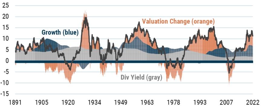
As of 4/30/2022 | Source: Robert Shiller
The gray segment captures the return from yield, the blue segment captures the return from growth, and the orange segment captures the return from valuation change.
Let’s say we start from a position of equilibrium, so stocks are priced at fair value to give a 6% real return. In equilibrium, we should expect zero changes in valuation, so the returns should come from growth and yield.
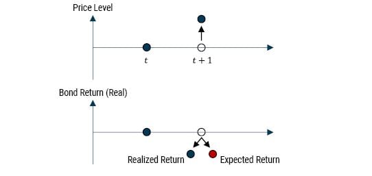
Now imagine in the first year you get a 12% return (way above your expectation), and this extra windfall has all come through valuation change. Effectively, Mr. Market, a chronic sufferer of bipolar disorder, is in one of his manic phases. How should you react? Well, given the stipulations above, you should expect to receive less than 6% from stocks in the next year as they are now priced above fair value, a situation that should correct over time. This is shown in Exhibit 4. More formally we can say the relationship between your unexpected return (forecast error) and your forecast update (how you change your view) is negative. 5
EXHIBIT 4: RELATIONSHIP BETWEEN RETURN AND EXPECTED RETURN FOR STOCKS
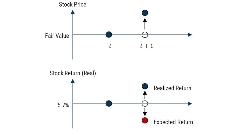
Source: GMO
The historical evidence suggests that this is a pretty good description of the way stocks have evolved. Just imagine you are living in 1871 and you know the future with certainty. You could calculate the true worth of stocks by summing up all the discounted dividend payments looking forward. This idea was first used by Robert Shiller 6 and is labelled clairvoyant fair value in Exhibit 5.
EXHIBIT 5: CALCULATING FUTURE FAIR VALUE USING SHILLER’S CLAIRVOYANT FAIR VALUE
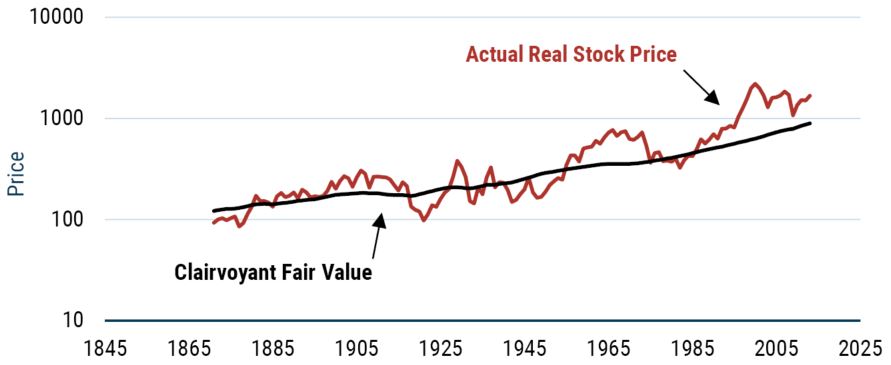
Source: Robert Shiller, GMO
As is clear from even a cursory glance, clairvoyant fair value (the discounted stream of underlying cash flows) evolves reasonably smoothly. In contrast, the real price of stocks has moved around wildly. In fact, the real price of stocks has been 16 times more volatile than the clairvoyant fair value. Thus, the high short-term volatility of stocks comes from the excessive swings in price around fair value. However, the slower moving fair value acts as an anchor, albeit a weak one, in the short term. It is the mean reversion of valuations that helps create the profile of volatility we observed earlier, whereby long-term volatility grows less fast than a random walk model would suggest.
The Empirical Evidence II – The Strange Case of Real Bond Returns
Okay, so far, so good.
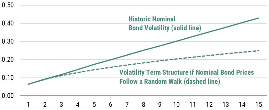
Before we turn to the other series – bond returns in real terms – in Exhibit 2, we will take a short detour into nominal bond returns. As the volatility plot in Exhibit 6 shows, bond returns in nominal terms don’t appear to be mean reverting. In fact, the volatility profile shows the volatility of nominal bonds rising faster than we would expect to see if those returns followed a random walk! This is often described as mean aversion, the complete opposite of mean reversion. However, mean aversion is a very unappealing trait for any financial series as it implies explosiveness.
EXHIBIT 6: VOLATILITY OF THE NOMINAL BOND RETURN AS A FUNCTION OF RETURN HORIZON
Source: GMO
The solid line is calculated using historical returns. The dashed line is calculated by taking the 1-year return volatility and multiplying it by the square root of the return horizon. Horizontal axis is return horizon in years.
The concept of mean aversion also feels at odds with the evidence on yields and returns that don’t appear to be mean averting. So, what on Earth is going on?
Rather than implying some sort of pathological explosive behavior, we think the observed volatility profile is once again reflective of time-varying returns. As noted earlier, the random walk model implicitly assumes a constant expected return (at least if it is a random walk with drift). However, this seems like a very odd assumption for bonds. Should you really expect the same return from a bond when its initial yield is 3% as when it is 6%?
We would, of course, argue “No!” This suggests that the relationship between your unexpected return (forecast error) and your forecast update (how you change your view) is negative just as we saw with stocks. Put another way, if you started from a position of fair value, whatever that might mean in the context of bonds, and you had earned a very big positive return in the first year of owning the bond, the price of the bond will have risen, the yield will have dropped, and you should therefore update your forecast to reflect the new lower yield. This is exactly the same process we saw with stocks earlier.
This, of course, raises the question as to why you see such a strange volatility profile. The answer lies in the fact that the relationship between forecast error and an updated process is a necessary but not sufficient condition for a volatility profile to rise less quickly than a random walk when dealing with expected returns that change over time.
In addition to satisfying this criterion, it transpires that short-term volatility of the asset returns must exceed a critical threshold related to the volatility of the forecast update, the correlation between the forecast error and the forecast update, and the speed of mean reversion. 7 In the case of bonds, the condition has an economic interpretation of the duration of the bond being higher than the mean reversion period. So, for 10-year maturity nominal bond returns we estimate that mean reversion period to be around 20 years, while the duration, although obviously time varying, averages around 7 years in our sample (see Exhibit 7). Because the condition for slower than random walk volatility growth isn’t met, we see a volatility profile that rises faster than a random walk but isn’t evidence of explosiveness.
EXHIBIT 7: NOMINAL BOND YIELDS AND NOMINAL BOND RETURNS
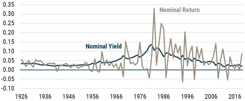
As of 12/2019 | Source: Robert Shiller
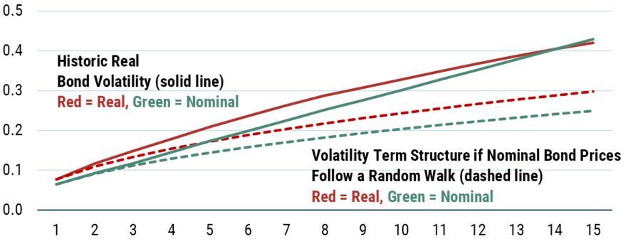
Having detoured into nominal bond returns, we can now return to the series that actually interests us, which is nominal bond returns expressed in real terms. This is the volatility profile plotted alongside real stock returns in Exhibit 2 and it is plotted again this time with the nominal bond volatility profile in Exhibit 8.
EXHIBIT 8: VOLATILITY OF THE NOMINAL AND REAL BOND RETURNS AS A FUNCTION OF RETURN HORIZON
Source: GMO
Solid lines are calculated using historical returns. Dashed lines are calculated by taking the 1-year return volatility and multiplying by the square root of the return horizon. Horizontal axis is return horizon in years.
As you can see, the real bond return profile rises faster than if it followed a random walk, as well as rising even faster than the nominal bond return series. Because the only difference between the two series is the inclusion of inflation in the real series, we know this rise must be related to that aspect.
In fact, the transformation of a nominal series to a real series actually turns our intuition about prices, yields, and expected returns on its head. Let’s say you own a nominal bond and when you bought that bond you had an expected inflation rate in mind. It transpires that inflation was actually higher than you expected, so even if your nominal return forecast were correct, your realized real return would be lower than you had expected. Not only that, but because inflation is now higher than you expected (even if you had assumed mean-reverting inflation expectations) your expected return is going to be lower, everything else held constant. So, unexpected inflation potentially moves both the realized real return and the expected real return lower – creating a positive correlation between the forecast error and the updating of your expected return – exactly the opposite of what we expect for equities and nominal bonds. Exhibit 9 illustrates the basic concept. 8
EXHIBIT 9: RELATIONSHIP BETWEEN REAL RETURN AND EXPECTED RETURN FOR BONDS
Source: GMO
Conclusions from Modelling Your Assets
The random walk is not a good description of a return-generating process for either real equity returns or real bond returns. The empirical evidence clearly indicates that real stock returns are best modelled as a mean-reverting process. Real bond returns have a volatility profile that rises faster than a random walk suggests. So, if you are using a Monte Carlo simulation for either series that is based on a random walk, you will be overestimating the uncertainty around real equity returns and underestimating the uncertainty around real bond returns.
To model the volatility profiles for real stock returns and real bond returns in Exhibit 2, we estimate the various parameters we need such as the return variance and the speed of mean reversion from the data. We also need a model for the way we update our expectations of future returns. For stocks, expected return is driven by the mean reversion of valuation as we showed above, thus our model of expected returns is driven by Shiller P/E. For bonds, the expected return we use is the simplest model: the spot real yield. These models give us more of the parameters we are interested in. Finally, we estimate the correlation between the forecast error and update to our forecast, which will give the best fit to the empirical data we have. As Exhibit 10 shows, this methodology ends up giving us a pretty good fit for the time series we are interested in.
EXHIBIT 10: FIT OF THE VOLATILITY OF STOCK AND BOND RETURNS
Source: GMO
The solid and dashed lines are the volatilities of the real return on stocks and bonds as a function of return horizon, as shown in Exhibit 2. The dotted lines are least squares fits based on (5) in Appendix I. The fitting solves for correlation 𝜌 that minimizes the difference between model and historical variance, assuming the values for 𝜎𝑒, 𝜎𝑢, and 𝑏 in Table 1. For stocks, the best fit correlation is -0.73, and for bonds is 0.51. Horizontal axis is return horizon in years.
Implications
So, why does any of this matter? The short answer is that it can have massive implications for the portfolios you own. This will be illustrated below but before we get there it is worth highlighting how the above relates to one of the most famous debates in financial planning, so-called “time diversification.”
Reconciling Siegel vs. Bodie
One of the most common investment debates in the field of retirement planning is the extent to which equities are “less risky” as your time horizon increases. On the one hand, we have Jeremy Siegel who takes work like that presented above to make the claim that equities are less risky in the long term. On the other hand, we have Zvi Bodie who agrees on the empirics of stock market volatility but says “investors should be concerned with the amount of wealth they will have at the end of T years…the probability distribution of terminal wealth becomes more spread in contrast to the distribution of average annual rates of return.” In fact, both of these statements are true! But obviously, they seem to give conflicting advice. On the one hand, own more stocks. But on the other hand, own fewer stocks. Where’s a one-handed economist when you need one?
From our perspective, the confusion arises because they are both asking the wrong questions. We agree with both authors. That is to say Siegel is right, as we showed above, that the volatility of equities rises more slowly with time horizon than the volatility of bonds. And Bodie is right that the volatility of terminal wealth rises with horizon. However, they are both implicitly assuming that the risk is measured by the standard deviation of returns. As noted above, we think of the volatility of returns as a characteristic of the asset in question, but not a good measure of the risk that we should care about. We argue that the real risk you face from a retirement perspective is not having enough wealth when you need it.
As Tarlie and Inker have detailed (Investing for Retirement: The Defined Contribution Challenge), we can think of the retirement problem as being composed of two questions: how much do you need and when do you need it? As they detail in their paper, this leads naturally to an expected shortfall approach to portfolio construction where the real risk you face is not having enough in your capital pot when you retire. When we marry this framing and our approach to modelling the data generation process for real equity and bond returns, we get some very interesting results. 9
Before moving on, we would like to emphasize a key point. Anytime you are solving a long-term investment problem, there is a crucial distinction that needs to be made between long-term and short-term risk. Long-term risk is not having the money you need when you need it. Short-term risk is suffering a drawdown in the near future. Such a near-term drawdown might have little or no impact on the likelihood of long-term success for clients that stick with their investment program. 10 But clients that fire their advisor because they could not tolerate the short-term drawdown in their portfolio most assuredly cannot be assumed to stick with the investment program. It is unwise for an investment advisor to put clients in a portfolio that is riskier than the clients can tolerate. On the other hand, it is arguably just as unwise for an advisor to fail to educate clients about the fact that their short-term loss aversion may well jeopardize fulfilling their long-term investment goals. 11
Common Glide Paths Are Based on Bad Assumptions that Could Ruin You!
One ubiquitous feature of retirement planning is the concept of the glide path – tracing out the allocations to equities and bonds as a function of the age of the investor. Exhibit 11 presents four such glide paths. The optimization in each case is an expected shortfall model, but the glidepaths are driven by differing assumptions about the return generation process for real equity and real bond returns. 12
The bottom right diagram shows the “standard” approach, where both real equity and real bond returns are modelled as a random walk. This random walk assumption produces a glide path with the equity allocation sliding from around 70% at age 45 to around 40% at retirement, and then down to 15% at the end of the projection.
The top left shows the glide path generated when we use an assumption of returns that is consistent with the empirical evidence: stocks display real return mean reversion and bond real returns show a volatility profile that rises faster than a random walk. The results are massively different. The weight in equities is far higher than the random walk glide path at all points in time. Under this set of assumptions, a 45-year-old should have 100% in equities, fading to around 60% at retirement, and then gently declining to around 20% at the end of the projection.
The key point to focus on here is not the specific shape of each glide path, as the details also depend on the utility function of the investor, but rather on how the glide path changes when we change how we model asset returns.
The top right and bottom left glide paths show the other combinations of assumptions that are possible. It becomes very clear that the way you choose to model real equity return behavior is vitally important. That is to say the differences between the upper and lower panels are greater than the differences between the left and right sides of the exhibit. If you believe that real equity returns display mean reversion characteristics, then if you are using an expected shortfall framework you should want to own far more equities (assuming fair value) than you would if you believed they followed a random walk.
Exhibit 11: GLIDEPATHS FOR DIFFERENT RETURN-GENERATING PROCESSES
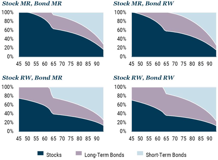
Source: GMO
Horizontal axis is age in years.
It should be noted that isn’t because you believe that equities are less risky in some sense à la the Siegel/Bodie debate discussed above, but rather because a portfolio that owns more equities reduces the risk of not having enough capital at and beyond retirement.
Let’s dive into a little more detail on this point by comparing the three post-retirement strategies illustrated in Exhibit 12. The first in the top left corner is a common “standard” glidepath that starts at around 50% weight in equities at age 65, declines to about 30% in the client’s early 70s, and flattens out from there – a pattern very similar to the glidepath we generated assuming both stock and bond returns followed a random walk. Second, in the top right corner, is an optimal shortfall glidepath that starts with an equity weight around 60% that slowly declines as the client ages but that always assumes that assets are fairly priced. Third, in the second row, is an optimal shortfall approach that illustrates the stock and bond weights based on market conditions as they might evolve over the lifespan of the investor.
Exhibit 12: ILLUSTRATIVE POST-RETIREMENT GLIDEPATHS
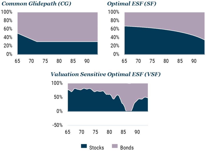
Source: GMO
Horizontal axis is age in years
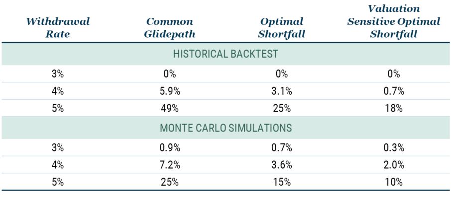
To compare these three “horses,” we simplify the problem by considering only stocks and bonds. This simplification allows us to use Robert Shiller’s data for stocks and bonds, which extend back to 1881. We start with a 65-year-old that has just retired with $1 million, in real terms. We then project 30 years into the future at various constant spending rates and ask whether the retiree runs out of money at any point over the 30-year period. As an example, a 5% spending rate corresponds to spending $4,167 per month, in real terms. We then repeat this process for all complete 30-year periods from 1881 to 2018. The probability of ruin is then the fraction of years in which the retiree’s wealth falls below zero. While this study is a bit unrealistic in that it assumes constant spending in real terms, it is an objective way to compare the three strategies.
The upper panel of Table 1 illustrates the probability of ruin for the three horses and for three different withdrawal rates using historical Shiller data. We clearly see that by asking the right questions – “What do you need and when do you need it?” – the probability of ruin is cut in half. For example, for the 4% withdrawal rate, the Common Glidepath has a probability of ruin of about 6%, which drops to about 3% for the Optimal Shortfall strategy. Furthermore, we also see that by “moving your assets” based on valuation, the probability of ruin is cut even further, in this case to 0.7%.
While the historical backtests are useful in that the returns represent what investors would have experienced and the historical range of 138 years is relatively long, mean reversion is relatively slow so the number of independent observations is not terribly large.
To address this potential shortcoming, we run Monte Carlo simulations. Note that these Monte Carlo simulations incorporate mean reversion as well as the modelling of how the volatility profile depends on horizon. We see in the lower half of Table 1 that the Monte Carlo results are consistent with the historical backtests in the sense that the Optimal Shortfall approach cuts the probability of ruin by about half and adding in Valuation Sensitivity cuts it by about another third.
Table 1: Probability of Ruin
Source: GMO
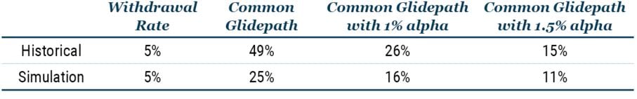
One way to frame the reductions in probability of ruin it to ask how much return we need to add to the Common Glidepath strategy to achieve results comparable to the Optimal Shortfall and Valuation Sensitive Optimal Shortfall strategies. Table 2 illustrates that for the 5% withdrawal rate, the implied alpha is in the range of 1.0% to 1.5%. More specifically, if we increase the return on the Common Glidepath portfolio by 1% annually, we generate the same probability of ruin values as the Optimal Shortfall Glidepath for the historical backtest and the Monte Carlo simulations. Similarly, if we add 1.5% annually to the Common Glidepath returns, we generate the same probabilities of ruin as for the Valuation Sensitive Optimal Shortfall approach. This clearly demonstrates the potential power and benefit of a framework that asks the right questions and is based on realistic modelling of the return-generating processes.
Table 2: Alpha Equivalency
Source: GMO
Conclusion
This paper has sought to highlight the need for critical thinking in the context of retirement planning (and in investment more generally). We need be mindful of and question the assumptions that all too often lurk unchallenged in the background. As is ever the case, it is often these assumptions that end up driving the results you obtain.
The assumption of the return-generating process following a random walk for both stocks and bonds is ubiquitous in the Monte Carlo simulations used in the context of retirement planning, but it is rarely, if ever, actually examined or questioned. The rationale for using this assumption is stuck in the conventional wisdom of the 1970s, when the academic literature was generally characterized by belief in the random walk hypothesis. As Keynes long ago noted, “Practical men who believe themselves to be quite exempt from any intellectual influence are usually the slaves of some defunct economist.”
However, the academic world has moved on. Predictability is one of the “new facts in finance,” to borrow John Cochrane’s phrasing. Our work above ties in with these views on predictability and suggests a way of modelling the return-generating process that is not only consistent with the empirical evidence but also offers insights into the economic foundations and mechanisms that generate the returns. Sticking with the 1970s view of the return-generating process in investing today is equivalent to redecorating your home by putting down orange and brown shag carpets and installing an avocado green bathroom suite while sporting bell-bottoms or pork chop sideburns. It is time to move on – seriously!
The results from combining an expected shortfall framework with this approach to modelling returns gives a radically different “glidepath” for asset allocation over the life cycle when compared to the results generated from an assumption of random walk behavior. We believe the risk of ruin is very significantly reduced by following this new glidepath.
It is time for financial planners to follow the approach often attributed to Keynes: “When the facts change, I change my mind.” At the very least, those relying on the random walk model to guide their understanding of the return-generating process must clearly articulate why they are choosing an approach at odds with the evidence.
Appendix
Please download the full article to read two Appendices. Appendix I further examines the volatility profiles in Exhibit 2. Appendix II presents a simple model of the real bond return that illustrates how a positive correlation between forecast error and change in expected return is possible.
Download article here.
Disclaimer: The views expressed are the views of James Montier and Martin Tarlie through the period ending July 2022 and are subject to change at any time based on market and other conditions. This is not an offer or solicitation for the purchase or sale of any security and should not be construed as such. References to specific securities and issuers are for illustrative purposes only and are not intended to be, and should not be interpreted as, recommendations to purchase or sell such securities.
Copyright © 2022 by GMO LLC. All rights reserved.
"There Is No Alternative" is used by some to explain a less than ideal portfolio allocation because other asset classes offer even worse returns.
In the random walk theory, changes in asset prices have no memory. See Appendix I for details.
Kim and Omberg (1996) show, for example, that there is a rich set of horizon-dependent solutions once you allow for time-varying expected returns.
The GMO Needs-Based Allocation (NEBO) platform not only operationalizes time-varying expected returns, but also embeds them within a framework based on asking the right questions (i.e., what do you need and when do you need it?). For more information, please visit www.gmo-nebo.com or contact us directly.
As we will see a little later, this is actually a necessary but not sufficient condition for a slower than random walk volatility profile.
See Robert Shiller, Market Volatility, 1992, MIT Press.
For those interested, details are laid out in Appendix I.
Details can be found in Appendix II.
The paper Investment Horizon and Portfolio Selection by Martin Tarlie :: SSRN, Tarlie (2016) fleshes out the expected shortfall framework in the context of mean-reverting expected returns.
To take an easy example, a 35-year-old with a relatively small nest-egg would be more likely to meet her long-term retirement goals if the stock market were to immediately fall 50% and stay cheap for a significant period of time, as the benefit of investing her future savings at attractive valuations would far outweigh the losses of her current investment portfolio.
The GMO NEBO platform (www.gmo-nebo.com) helps advisors handle these problems in two distinct ways. First, it allows an advisor to put in short-term portfolio risk limits and limits on asset class weights, building portfolios that maximize long-term success subject to those constraints. Second, it gives the advisor the ability to show how the odds of long-term success are altered by imposing the constraints that reduce the probability and scope of short-term losses, helping the advisor educate clients about situations where their loss aversion is damaging to their ultimate financial health.
The GMO NEBO platform not only operationalizes time-varying expected returns, but also embeds them within a framework based on asking the right questions (i.e., what do you need and when do you need it?). For more information, please visit www.gmo-nebo.com or contact us directly.