Executive Summary
Inflation is often a poorly understood concept, with monotheistic explanations abounding. Money supply or fiscal deficits are oft-blamed suspects in the conventional wisdom. In reality, history teaches us that inflation is frequently more complex than such simple-minded explanations allow. Inflation is invariably, as Wicksell put it, a “cumulative process” in that it involves a feedback loop between prices and costs. Labour costs are particularly important in the production process, and thus a sustained inflation requires wages to rise significantly faster than productivity (as we have noted before, we have actually been witnessing the opposite situation for a long period of time now – a phenomenon known as wage repression). Without a radical shift in labour’s bargaining power (of which there is yet no sign) it is unlikely that inflation will be able to embed itself in the system. Thus, we believe the upsurge in inflationary angst is likely much ado about nothing.
Fears of inflation often make themselves felt at the strangest times. During the 2008-09 recession many were warning of inflation and even hyperinflation due to the government and central bank policies being enacted in response to the crisis. We have repeatedly pushed back on these ideas and pointed out that crude monetarist stories about quantitative easing, much less hyperventilating about becoming Zimbabwe, were deeply misguided.1 Economic predictions are often hard to prove or disprove, but we think we have been vindicated on this one. What followed quantitative easing and government stimulus was not accelerating inflation, but economic stagnation and low inflation.
However, times have changed. The nature of the present economic shock is entirely different from the last one. Whereas 2008-09 was a classic debt deflation demand shock, this time large parts of our economies have been shuttered; this has led to a supply shock that has generated a demand shock.2 Businesses are closed to consumers whilst staff are laid off and lose income. The consumers that have kept their jobs have fewer places to spend their money, while those laid off from closed businesses have less income to engage in consumption.
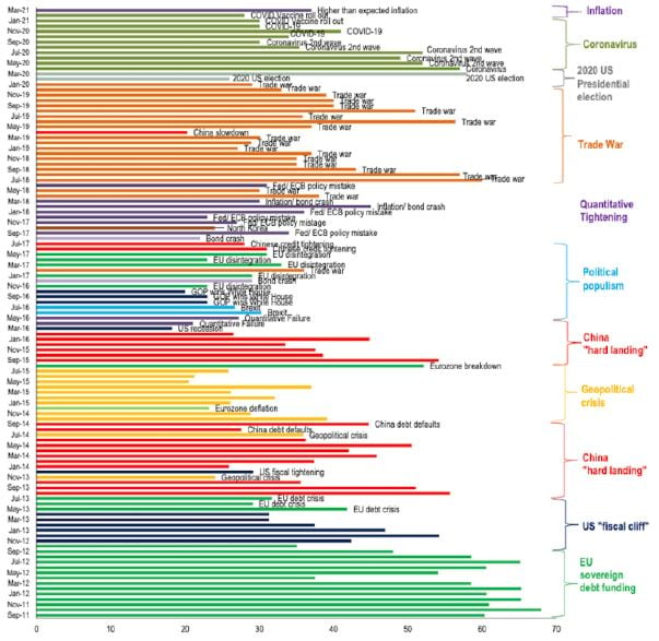
Whilst the times have changed, the stories of the inflationistas have not (see Exhibit 1). They continue to resemble the little boy who cried wolf. This is problematic because this time around there are risks of short-term inflation, but not the ones that the inflationistas are discussing. Understanding the underlying causes of inflation is vital in determining how to hedge them.3
Exhibit 1: BOAML Global Fund Manager Survey: Fears of Inflation Risk Top the “Tail Risk” Charts
As of 6/30/2021 | Source: BofA Global Fund Manager Survey
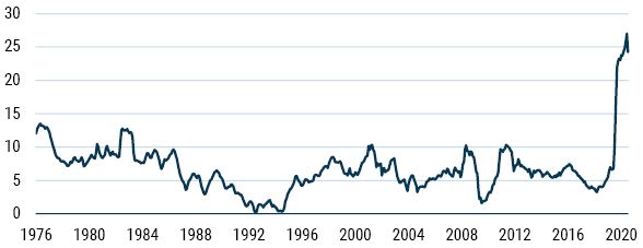
According to the consensus view, the two leading culprits of inflation risk today are the fiscal deficit and the money supply. To illustrate, take this CNBC headline, “The ballooning money supply may be the key to unlocking inflation in the US,” which precedes the quote that “the Fed may not be in control of Money Supply growth, which means they won’t have control of inflation either, if it gets going.” News flash: the Fed hasn’t controlled the money supply for years (ever since the Volcker experiment in the very early 1980s). The Fed sets the interest rate (the price of money), not the quantity of money. On the fiscal front we need only look to the always opinionated Larry Summers who suggested recently, “These are the least responsible macroeconomic policies for 40 years.” It is true that today both the fiscal deficit and money supply are at record levels not seen since the Second World War. But they are not risky in and of themselves.
Monetary Delusions
Exhibit 2: US Money Supply Explodes (M2 YoY)…Is the End Nigh?
As of 6/30/2021 | Source: Datastream
The quantity theory of money simply states that all the money in the economy multiplied by the number of times it goes around must be equal to the prices paid times the volume of goods and services purchased (MV=PY where M is the money supply, V is the velocity of circulation, P is prices, and Y is the volume of output). In other words, it says that expenditure equals income, which is nothing more than an identity.
In order to turn this into a theory of inflation, one has to make some rather unrealistic assumptions such as velocity being fixed and output being fixed. If one is willing to make such assumptions, then by construction the only two variables are money and prices, ergo changes in money must be matched by changes in prices according to adherents to this view. Thus, they believe the equation becomes…
![]()
…where a bar denotes a fixed quantity.
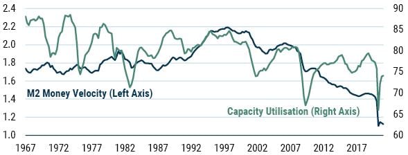
How realistic are the assumptions that output and velocity are fixed? Honestly, about as believable as statements that the moon is made of cheese or the Earth is flat. As Exhibit 3 shows, both velocity and output fluctuate wildly. The assumptions behind statements that the money supply drives inflation are simply invalid.
Exhibit 3: So Much for a Constant Velocity or Fixed Output
As of 6/30/2021 | Source: Datastream
Additionally, the absurdity of the assumptions at the current juncture is extreme. We have recently witnessed the worst GDP declines we have seen since the Great Depression. This means that output and money velocity fall precipitously, as we can clearly see in the exhibit. So, why on Earth would we use a framework that assumes fixed output and money velocity?
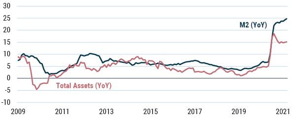
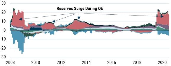
Finally, as we have often pointed out before, a large part of the surge in money supply is really a product of the Fed’s QE operations (a maturity transformation). Essentially, the Fed buys fixed income assets (like government bonds) from the private sector and issues cash/reserves in their place. The former aren’t defined as part of the money supply, whereas the latter are. Hence QE leads to increases in the money supply. To see this most clearly it is easiest to consider the overall assets of the commercial banking system, which track very closely with money supply aggregates such as M2 (see Exhibit 4).
Exhibit 4: US M2 (YoY) and Total Assets of the Commercial Banking System (YoY)
As of 6/30/2021 | Source: Datastream
Exhibit 5 breaks down the various components of the total assets of the commercial banking system. It is clear that the expansion of the total assets (and hence the money supply) has been reserves, exactly as we stated above.
Exhibit 5: Contribution to YoY Growth of the Assets of the Commercial Banking System
As of 6/30/2021 | Source: Datastream, GMO
Fiscal Fallacies
The equation of exchange MV=PY illustrates a link between the monetary delusions arguments and the fiscal fallacies to which we now turn. We can expand the Y (output) term into its components as per Macro 101: Y = C+I+G+(X-M) where C is consumption, I is investment, G is net government spending, and (X-M) is the current account. This simple expansion makes it very clear there is nothing unique or special about government spending in terms of inflation. All elements of spending can generate inflation if they push aggregate demand above the economy’s ability to produce output. But for some odd reason people seem to think fiscal deficits are especially inflationary (a fallacy we have explored previously4).
This isn’t to say that fiscal deficits can’t be inflationary. Of course they can, but so can any element of aggregate demand. When a government runs a fiscal deficit, it is spending money into the economy. Unlike with central bank operations, this money is either spent directly or given to people who can easily spend it. But whether this activity is inflationary depends on how much potential output is available in the economy. If the economy is experiencing sluggish growth or a recession, then an increase in fiscal spending by the government will simply get the economy growing again.
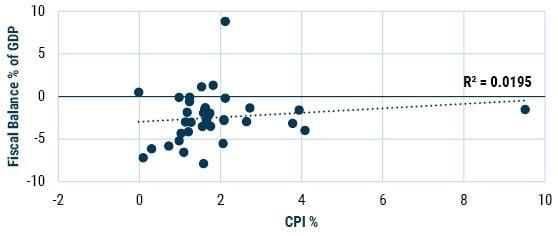
The impact of fiscal deficits on the economy is complicated and requires careful analysis. For this reason, we see no simple correlation between fiscal deficits and inflation. For example, Exhibit 6 takes data from 37 countries and plots the average fiscal balance as a percent of GDP over 10 years and compares it to the average annual inflation rate over the 10 years from 2009-19.
Exhibit 6: Fiscal Balance and Inflation
As of 6/30/2021 | Source: OECD
Here we see that not only is the sign wrong – if anything, a higher fiscal balance is associated with higher inflation – and that there is no solid correlation, but that most countries experience between 0% and 2% inflation even though fiscal balances tend to be anywhere between -8% and +2% of GDP. The two extreme outliers also seem to discredit any simple relationship. Nothing to see here!
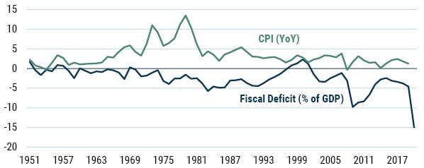
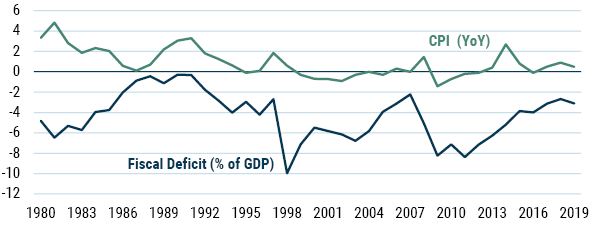
Similarly, a time series analysis of deficits and inflation shows no meaningful relationship of any kind (see Exhibits 7 and 8). Unsurprising given what we have already said, but surprising given the obsession with fiscal deficits that many have on the alleged grounds of the “clear and present danger” they pose on the inflationary front.
Exhibit 7: US Inflation and Fiscal Deficits
As of 6/30/2021 | Source: Datastream
Exhibit 8: Japan Fiscal Deficit and Inflation
As of 6/30/2021 | Source: Datastream
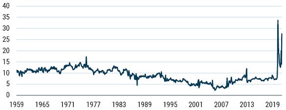
We will note before moving on that when it comes to fiscal policy, this time was different. Typically, when money is distributed to people it results in an increase in spending. But during the pandemic, we saw a massive increase in the personal savings rate when the government sent out checks (see Exhibit 9).
Exhibit 9: US Personal Savings Ratio
As of 6/30/2021 | Source: FRED
This increase probably stemmed from the enormous amounts of uncertainty in the face of the lockdown. People did not know whether they would have jobs when the lockdown ended; indeed, they did not know when the lockdown would end or, if so, whether it would be reinstated at a later date. So, it was perfectly rational for people in this position to squirrel away their government stimulus checks in case the worst were to happen.5 Besides, it is hard to spend income when you’re not allowed to go to the shops.
The Labour Market as an Inflationary Force
Whilst the common discussion of inflation still focuses on monetarist and fiscal theories of inflation, many a central banker seems to prefer to discuss the Phillips Curve and the Non-Accelerating Inflation Rate of Unemployment (NAIRU). These frameworks argue that inflation tends to emerge from the labour market. The idea is simple enough. As an economy grows faster and faster, this translates into a shrinking pool of unemployed workers. As the demand for labour increases and the supply of labour decreases, the price of labour goes up. Wages rise and with them prices. A very tight labour market, especially in the NAIRU framework, can give rise to ever-spiraling wages and prices accompanied by persistent high inflation.6
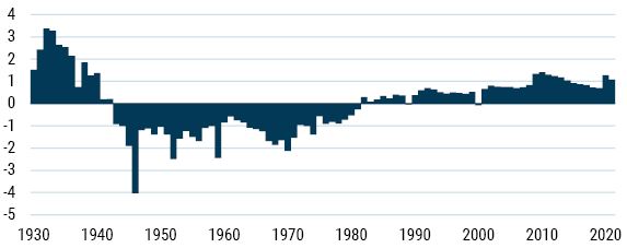
We have been quite critical of both the Phillips Curve and the NAIRU. Neither has performed well empirically. We believe the core reason for this is that these frameworks ignore the question of worker bargaining power. Effectively, they model the labour market as just another market with its make-believe demand and supply curves. However, to raise wages workers need to have bargaining power against their employer. We agree that low unemployment increases the bargaining power of workers, but this is not the only variable. We also need to understand to what extent workers are unionized and how willing unions are to use their power. To capture this, we created a Worker Bargaining Index (WBI), constructed by using the number of strike days per year, union membership as a percent of total workforce, and the unemployment rate.
The first two have a positive impact on worker bargaining, whilst unemployment has a negative impact. Positive readings indicate diminished worker bargaining power, negative readings indicate increased worker bargaining power.
Note that we do not expect the WBI to be correlated with inflation rates. The WBI captures only the inflationary potential arising from the labour market. Whether this potential is realised or not is contingent on other factors.
In Exhibit 10 we see that worker bargaining power decreased substantially in 2020 and remained subdued moving into 2021. This is due mostly to the large increase in the unemployment rate, but it also appears that unionization rates have fallen by around 15% since the last recession and workers seem slightly less inclined to engage in strike action. Overall, we do not think there is much need to be concerned about an inflationary surge coming from the labour market.7 Whilst this situation persists, we think it is unlikely for a long-term wage price spiral (a key ingredient in inflations) to take grip.8
Exhibit 10: Worker Bargaining Power over Time
As of 6/30/2021 | Source: GMO
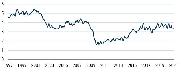
For a concurrent read on the potential inflationary pressure emanating from the labour market, one of the indicators that is worth tracking is the Atlanta Fed Wage Growth Tracker (see Exhibit 11). This is a measure constructed from the micro-level data found in the Current Population Survey and traces the median percent change in hourly wages of individuals over the last 12 months. Currently this tracker doesn’t seem to be evidencing any serious inflationary threat.
Exhibit 11: Atlanta Fed Wage Growth Tracker (% YoY, unweighted, 3-month average)
As of 6/30/2021 | Source: Atlanta Federal Reserve
It’s the Supply-Side, Stupid!
Whilst the outlook for longer-term inflation remains subdued, there remain reasons for exercising some caution about the short term. The lockdowns we have witnessed have been an enormous and completely unique intervention into the economies upon which they have been imposed.
Massive interventions in the past, like the mobilization in the US for the First and Second World Wars, did not negatively impact the growth of the economy. In fact, they tended to increase economic growth. These particular interventions switched the economy from producing end goods for consumption to producing end goods to be used in war. This led to fewer consumption goods but did not lead to factories and businesses being shuttered; instead, they were retooled for the war industry.
The pandemic lockdowns were perhaps the first truly massive supply shock in history that were done by design and on such a large scale. To think it through, we can turn to a very simple macroeconomic model that is taught to undergraduate students in most economic courses: the Aggregate Supply-Aggregate Demand (AS-AD) model of the economy. (N.B. we are not fans of this model, but it is a simple exposition of the risk we face today.)
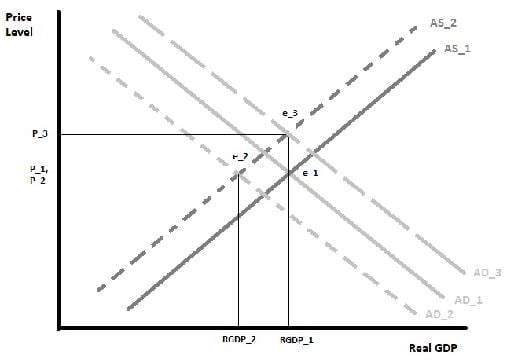
The AS-AD model (Exhibit 12) shows a series of equilibria between real GDP (X-axis) and price level (Y-axis). These are determined by the aggregate supply curves and aggregate demand curves. The aggregate supply curves represent the total amount of output an economy can produce – think physical factories, shops, various service establishments, etc. The aggregate demand curve represents the total level of spending in the economy.
Exhibit 12: Aggregate Supply-Aggregate Demand Model
As of 6/30/2021 | Source: GMO
We start before the lockdown at the equilibrium e_1. We then have a simultaneous collapse in both aggregate supply and aggregate demand due to the lockdown and the closures and income losses associated with it. This leaves us at equilibrium e_2. Here we see that, although real GDP has shrunk, prices remain stable. The assumption here is that the shop closures, etc., are matched by the income losses from laying off staff, etc. The result would be a major contraction in economic activity – a recession – shown by the fall from RGDP_1 to RGDP_2.
The stimulus that is being deployed to counter this recession aims to replace the lost demand. We have represented this as the aggregate demand curve AD_3. To get back to RGDP_1 – that is, the initial level of economic activity – the AD curve must be pushed further out to the right. This results in meeting the new AS curve at a much higher price level – prices have shifted from P_1 to P_3. Hence, we arrive at the conclusion: if there is a simultaneous supply and demand collapse in the economy, in order to prevent the economy from falling into a major recession stimulus will have to be deployed that will result in a higher price level (remembering that inflation is how we define a change in the price level, so this suggests an increase in inflation but, again, not a long-lived one necessarily).
Looking across history, the best analogy that we have come up with is the ending of rationing in postwar Britain. Like a lockdown, rationing represents an arbitrary restriction of supply in an economy. The aim of rationing is to ensure that price inflation does not take place. When goods are rationed – because the economy is mobilized for war and goods are needed at the front – ration books that allow each person to purchase only a restricted amount of a given product are handed out. This ensures that people who want more of that product and have more income do not simply bid up the price of that product.
In theory, when rationing is in place, we should not see any rise in prices. But when rationing is removed, there should be a surge in demand for the products and, hence, a rise in price. This is a predictable response to the immediate mismatch between supply and demand coupled with an attempt by producers to recoup the losses they incurred during the period of artificially low prices.
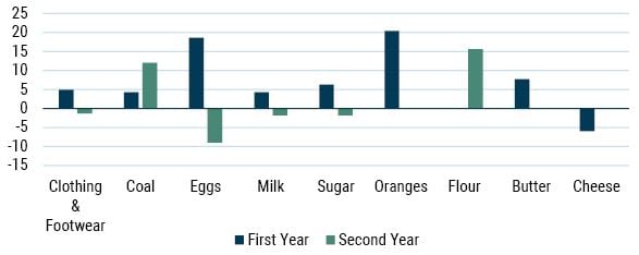
When we turn to the data from the UK post WW2, we see that many of the items that were rationed experienced substantial price increases in the first and second years after they were made exempt from rationing (see Exhibit 13).
Exhibit 13: Price Change of Rationed Items Minus Inflation After Rationing (United Kingdom post WW2)
As of 6/30/2021 | Source: GMO
This gives us some sense of what might be reasonable to expect for the US economy post pandemic. Because the US was entering a lockdown-driven deep recession in 2020, it was natural to expect the price of many goods and services to fall. But because of the enormous supply-side constriction placed on the economy, some sectors were likely to see price rises. As a very approximate guide as to whether we will experience something like the price responses witnessed at the end of rationing, we might expect US inflation to rise to 3.5-4.5% as lockdown restrictions ease and stimulus money makes its way into the economy…just as we are seeing currently.
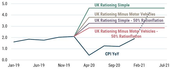
Exhibit 14 shows some simple projections we ran for inflation back in Q2 2020 based on our rationing numbers. We have also included the recent April surge in inflation (dotted line), which was caused by a rise in airline fares and used car prices. Our projection last year seems to have worked out pretty well in terms of providing a very rough and ready set of possible outcomes.
Exhibit 14: Rationing Model for US CPI*
As of 6/30/2021 | Source: GMO
*The projections assume the following. “Simple” assumes that the sectors impacted by supply-side restrictions in the current pandemic are impacted the same as the sectors impacted by rationing in the UK after the war. “50% Rationflation” assumes half that impact. The other two variants exclude motor vehicle prices on the assumption (at the time) that these might prove cyclical rather than be directly impacted by supply shocks. We now believe the evidence points to these prices being impacted more by supply shocks than by a cyclical effect. We see the April inflation data somewhere in the middle of our two projections that include motor vehicles.
And, much as it pains us to agree with the Fed on anything, at the current juncture we believe this is likely to be a temporary increase in inflation. For inflation to become embedded in the system, a wage price spiral is required. As we detailed above, this doesn’t look imminent.
Conclusions
Inflation is often a poorly understood concept, with monotheistic explanations abounding. History teaches us that inflation is frequently more complex than such explanations allow. However, inflation is, as Wicksell put it, a “cumulative process” in that it involves a feedback loop between prices and costs. Labour costs are particularly important in the production process, and thus a sustained inflation requires wages to rise significantly faster than productivity (as we have noted before, we have actually been witnessing the opposite situation for a long period of time now – a phenomenon known as wage repression). Without a radical shift in labour’s bargaining power (for which we see no sign), it is unlikely that inflation will be able to embed itself in the system.
Notwithstanding this analysis, it is always worth asking, “What if we are wrong?” As longstanding readers will know, we at GMO are huge fans of robust (as opposed to optimal) portfolios, recognizing the true ex ante nature of risk captured perfectly in Elroy Dimson’s expression that “more things can happen than will happen.” As such, Part 2 will address the topic of what one might actually do in the advent of inflation.
Download article here.


