Executive Summary
Never before have I seen a market so highly valued in the face of overwhelming uncertainty. Yet today the U.S. stock market stands at nosebleed-inducing levels of multiple, whilst the fundamentals seem more uncertain than ever before. It appears as though the U.S. stock market has drunk from Dr. Pangloss’ Kool-Aid – where everything is for the best in the best of all possible worlds. It is as if Mr. Market is taking a tail risk (albeit a good one) and pricing it with certainty.
Now let me be clear, I don’t claim to know the answers to any of the deep imponderables that face the world today. I have no idea what the shape of the recovery will be, I have no idea how easy it will be to get all the unemployed back to work. I have no idea if we will see a second wave of Covid-19 or what we will do if we do encounter such an event. But I do know that these questions exist. And that means I should demand a margin of safety – wriggle room for bad outcomes if you like. Mr. Market clearly does not share my view.
Instead, as best I can tell, the driving narrative behind a V-shaped recovery in the stock market seems to be centered on “The Fed” or, even more vaguely, “liquidity creation.” It is tricky to argue for any direct linkage from the Fed’s balance sheet expansion programs to equities. The vast majority of QE programs have really been about maturity transformation (swapping long debt for very short-term debt). Nor can one claim a good link between QEs to yields to equities. In fact, during each of the three previous waves of QE, bond yields actually rose. In addition, yields around the world are low but you don’t see other equity markets sporting extreme valuations. So, I think that Fed-based explanations are at best ex post justifications for the performance of the stock market; at worst they are part of a dangerously incorrect narrative driving sentiment (and prices higher).
The U.S. stock market looks increasingly like the hapless Wile E. Coyote, running off the edge of a cliff in pursuit of the pesky Roadrunner but not yet realizing the ground beneath his feet had run out some time ago.
Investing is always about making decisions under a cloud of uncertainty. It is how one deals with the uncertainty that distinguishes the long-term value-based investor from the rest. Rather than acting as if the uncertainty doesn’t exist (the current fad), the value investor embraces it and demands a margin of safety to reflect the unknown. There is no margin of safety in the pricing of U.S. stocks today. Voltaire observed, “Doubt is not a pleasant condition, but certainty is absurd.” The U.S. stock market appears to be absurd.
From Bull to Bear
Just a few short months ago I was bullish and penning my thoughts on the fear and psychology of bear markets. Little did I know I would find myself writing about the opposite situation in such a short space of time. However, since those dark days of late March, the U.S. equity market has rallied some 47%, other world markets nearly 38%, and even my much beloved emerging markets have turned in a 36% increase.
Both the speed and scale of the U.S. equity market decline and its rebound are rare events. In terms of the scale of decline and its speed I have been able to find only a few other examples to offer as comparison to determine whether sharp declines are often followed by sharp rebounds. We saw similar declines over roughly the same time period in 1987 (obviously, October 1987), late in the Global Financial Crisis (December 2008), and early on during the Great Depression (November 1929). Of the three, only the Global Financial Crisis experienced a similar, very sharp recovery (and this ignores the fact that the market had already declined by 40% before the period of the very sharp sell-off).
It would, of course, be foolhardy in the extreme to extrapolate any conclusions from a sample size of just these events. But I do believe I can say that a market does not have the divine right to display a sharp bounce-back after a sharp decline.
Exhibit 1: V–Shaped Recovery in Prices in the S&P 500
(and Some Historical Comparisons)
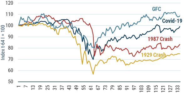
Source: Global Financial Data
As is often the case, it now appears as though most market participants – I hesitate to use the term investors – are back in full swing with Ian Dury and the Blockheads’ “Reasons To Be Cheerful” echoing through their heads. I have written countless times over the years that overoptimism and overconfidence are a particularly heady and potently dangerous combination because they lead to the overestimation of return and the underestimation of risk. This combination strikes me as the best description of our current juncture.
It is really the latter trait – the lack of appreciation for risk – that will be the subject of this short missive. One of my favorite definitions of risk comes from Elroy Dimson of Cambridge University who noted, “Risk means more things can happen than will happen.” I find this helps reinforce the unknowable nature of the future and highlights that history is just a series of discrete branches on a much larger tree.
So, when I look at a very sharp recovery like the one we have all just observed, I can’t help but wonder if the world has forgotten about risk. It appears to be as if the U.S. equity market in particular has priced in a truly Panglossian future where everything is for the best in the best of all possible worlds.
It is certainly true in theory that the stock market is meant to be a forward-looking device, capable of seeing through short-term issues. However, as an erudite soul1 once opined, “In theory there is no difference between theory and practice. But, in practice, there is.” History teaches us that the market is usually a master of double-counting, attaching peak multiples to peak earnings, and trough multiples to trough earnings.
For instance, in 1929 the U.S. market P/E was 37% above its long-term average, and earnings relative to 10-year earnings were 46% above their normal level. Similarly, in 2000 the market P/E was 98% above its average, and earnings relative to 10-year average earnings were 37% above their normal level. Peak multiples on peak earnings. In comparison, in 1932 the market was just 64% of its average valuation, and earnings relative to their 10-year average level were just 54% of the average – trough multiples on trough P/Es.
As Exhibits 2 and 3 show, today we see something different. Valuations on a Shiller P/E basis are in the 95th percentile (right up there in terms of one of the most expensive markets of all time), and economic growth measured as real GDP is in the 4th percentile based on pretty generous assessments of this year’s growth2 (which is one of the worst economic outcomes we have ever seen).
Exhibit 2: Shiller P/E Percentile 1881-2020
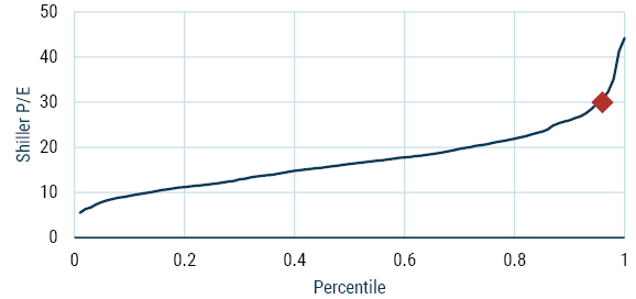
Source: Shiller
Exhibit 3: Economic GDP percentiles (assumes this year will see -6% for the full year) 1881-2020
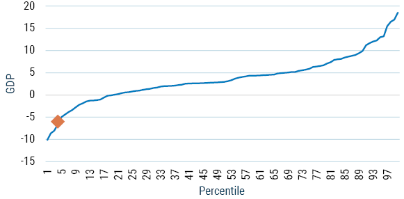
Source: Global Financial Data
Perhaps today’s market is truly “looking over the valley,” but it would be one of the few times in history when Mr. Market managed such foresight. Even if this is the case, the certainty with which a V-shaped recovery is being priced in reflects a potentially dangerous level of overconfidence.
Now, to be clear, I have no idea what the shape of any recovery is going to be. How one begins to choose between W, L, swoosh (like the Nike symbol, apparently), or perhaps something more exotic from the Cyrillic alphabet remains beyond my ken.
However, it strikes me that it is likely to be much harder to get the U.S. economy going again post Covid-19 than the market is implying. I don’t think for one second that it is simply a matter of flicking a switch back to the “On” position, which makes the V perhaps one of the least likely outcomes.
The shape of the recovery ultimately depends on a large number of frankly unknowable things such as a household’s ability and willingness to spend. In February there were 6 million unemployed people in the U.S.; today there are more than 30 million! One study from the University of Chicago3 estimates that up to 40% of the layoffs related to Covid-19 could be permanent! If these projections are even close to accurate about the permanent nature of some of these losses, then households may be unable or unwilling to spend as they had before the virus struck.
The impact on business in terms of bankruptcies and lower investment will also be key. It is easy to imagine that in the wake of the virus, entrepreneurs may be hesitant to try and start new businesses, which are often said to be the lifeblood of the U.S. economy. Sadly, many businesses will have failed due to the effects of the pandemic, and even those that do survive may likely find their animal spirits dampened significantly.
Now add in other causes for uncertainty relating to the continued developments surrounding Covid-19. What happens if there is a second wave in the Fall? As lockdown restrictions are lifted does it roar back? Exhibit 4 presents a frightening, real-time answer to the second concern as the U.S. is clearly struggling to contain the first wave of the virus.
Exhibit 4: Covid-19 Cases (5-day rolling average)
10 Most Affected Countries
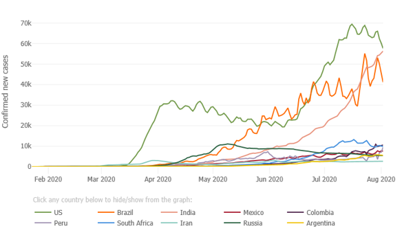
Source: Johns Hopkins University
I don’t know the answers to these questions, and I am going to refrain from participating in the very popular trend of becoming an armchair epidemiologist or virologist, but I do know that these questions and many others exist. I am also certainly not in the business of trying to second-guess how the future will unfold, but I do know that anyone claiming certainty of foresight is likely to be sorely disappointed. And yet, Mr. Market appears to be doing exactly that.
Howard Marks of Oaktree Capital often talks about there being two kinds of investors. The two groups can be broadly distinguished by their attitudes toward the future. The first camp is best described as “I know” investors. They think that knowledge of the future course of events such as growth and interest rates is vital to investing. They are confident that such knowledge is attainable, and they “know” they can forecast accurately. They are very comfortable investing on the basis of their views. They freely admit that others will be trying to do the same thing, but their insight is better: it is their edge. Such investors are very popular at dinner parties because they will chatter on about pretty much any subject.
In contrast, the second group of investors studied at the “I don’t know” school. They hold some very different beliefs about the way you should approach investing. They believe you can’t know the future, and, in fact, you don’t need to know the future in order to invest. Driven by this explicit embrace of uncertainty, they insist on a margin of safety when investing: valuation is front and foremost in their approach. This group is not particularly popular at dinner parties (or maybe it’s just me) as the frequent refrain of “I don’t know” in response to questions is not amazingly stimulating on the conversation front.
As should be obvious, I firmly identify with the “I don’t know” school, having already stated that I don’t know several times in response to some very important questions raised earlier in this missive. Naturally, when Mr. Market acts with what looks to me like extreme certainty, I get nervous. Even if my caution is completely misplaced, it does not change my view that the U.S. market has priced in all the good news it possibly can, suggesting very little upside from a fundamental point of view.
Now, of course many will argue that focusing on the fundamentals is a quaint, old-fashioned idea just as they had done during all the great bubbles we have witnessed and studied. They will argue that this is all about the Fed and then blather on about “liquidity creation,” usually in the vaguest of hand-waving fashion. Such protestations are sometimes accompanied by a visual aid such as Exhibit 5, as if it offers some proof of concept.
Exhibit 5: Fed Balance Sheet and the S&P 500
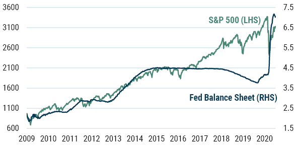
Source: Datastream
I find it strange that proponents of the narrative implicit in this exhibit didn’t speak up when the S&P soared during the 4 years from 2016 to 2020, when the Fed’s balance sheet was either flat or shrinking.
From a fundamental (there I go again, set in my old ways) perspective, it is tricky to argue for any direct linkage from the Fed’s balance sheet to equities. Most of the expansion of the balance sheet has been due to the various QE programs. And QE is really just a maturity transformation (i.e., purchasing long-term debt and replacing it with the ultimate form of short-term debt, excess reserves). The clue is in the term “balance sheet”: for every asset there must be a liability and vice versa. Hopefully, Exhibit 6 makes this very clear.
Exhibit 6: Fed’s Balance Sheet – QE Is Just Maturity Transformation
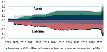
Source: U.S. Federal Reserve
To provide some context, the following is a breakdown of the Fed’s balancing act through the years shown in the exhibit. You should be able to match each of the phases to Exhibits 5 and 6 and trace their evolution through time.
- QE1: $2.3 trillion in assets. The Fed’s first QE program ran from January 2009 to August 2010. The cornerstone of this program was the purchase of $1.25 trillion in mortgage-backed securities (MBS).
- QE2: $2.9 trillion in assets. The second QE program ran from November 2010 to June 2011 and included purchases of $600 billion in longer-term Treasury securities.
Operation Twist (Maturity Extension Program). To further decrease long-term rates, the Fed used the proceeds from its maturing short-term Treasury bills to purchase longer-term assets. These purchases, known as Operation Twist, did not expand the Fed’s balance sheet and were concluded in December 2012. - QE3: $4.5 trillion in assets. Beginning in September 2012, the Fed began purchasing MBS at a rate of $40 billion/month. In January 2013, this was supplemented with the purchase of long-term Treasury securities at a rate of
$45 billion/month. Both programs were concluded in October 2014. - Balance Sheet Normalization Program: $3.7 trillion in assets. The Fed began to shrink its balance sheet in October 2017. Starting at an initial rate of $10 billion/month, the program called for a $10 billion/month increase every quarter, until a final reduction rate of $50 billion/month was reached.
- QE4: $7 trillion in assets. In October 2019, the Fed began purchasing Treasury bills at a rate of $60 billion/month to ease liquidity issues in overnight lending markets. On March 15, 2020 the Fed announced it would buy at least $500 billion in Treasury securities and $200 billion in government guaranteed MBS over “the coming months.” On March 25 it made the purchases open-ended in size. On June 10 the Fed said it would buy at least $80 billion/month in Treasuries, and $40 billion in RMBS/CMBS. A raft of other measures was also announced but pale into insignificance in terms of the Fed’s balance sheet. U.S. Treasuries held outright account for 64% of the Fed’s assets, and MBS almost 30%.
It is very hard to see how maturity transformation should engender massive enthusiasm for equities. You might be sitting there reading this, screaming silently that I am a moron and that the missing link is interest rates. To wit, by performing QE the Fed lowers the bond yield and, because this serves as the discount rate for other assets, it drives up the stock market.
I have several issues with this viewpoint. First, as long-term readers will know, I am very skeptical of a clear link between bond yields and equity valuations.4 A little international perspective helps illustrate one of the reasons for my skepticism. Japan and Europe both have exceptionally low interest rates, mirroring the U.S., but they aren’t witnessing stock market valuations at nosebleed-inducing levels. Second, even if I accepted the link, there is the problem still that if the interest rate is low because growth is low, then the valuation is unchanged in a simple DDM framework (see "Role of Interest Rates"). And third (and in my humble opinion the killer blow for this argument), QE hasn’t actually managed to lower bond yields, which truly emasculates the argument. As Exhibit 7 shows, all three of the completed cycles of QE have actually ended with yields higher than they were when the QE began!
Exhibit 7: U.S. 10-Year Bond Yield
(QE Programs Shaded)
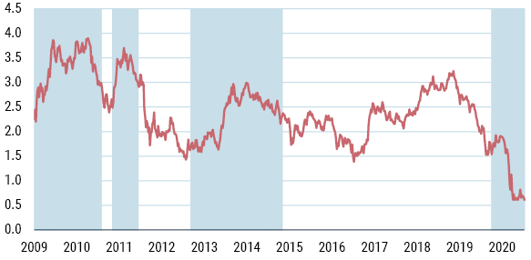
Source: Datastream
This all suggests there is a good chance that Exhibit 5 is just the result of spurious correlation. That is to say that two series happen to move together despite their being no underlying connection between them. When one studies statistics (as I did many, many moons ago) one is repeatedly taught that correlation does not equal causation for this very reason. One of my personal favorite examples, Exhibit 8, comes from Tyler Vigen and shows a 94.7% correlation between per capita cheese consumption and the number of people who die by becoming tangled in their bedsheets!
Exhibit 8: Spurious Correlation At Its Best
Per capita cheese consumption correlates with number of people who died by becoming tangled in their bedsheets
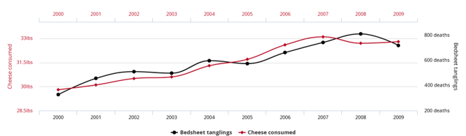
Source: tylervigen.com
Sadly, we humans are prone to love a story.5 Hence, when we see a correlation (even a spurious one) it is tempting to make up a story to explain the relationship. I think this is exactly what we see when people start talking about equities, the Fed, and “liquidity creation.”
Because I don’t think there is any fundamental relationship between the stock market and the Fed’s actions, I would suggest that this is either ex post justification or, at best, a driver of the ever-slippery concept of sentiment.
One final word of warning when it comes to markets and authorities. I am old enough to have been around when the Japanese engaged in their price-keeping operations from 1992 to 1993 with the aim of keeping the Nikkei 225 above a certain level. These attempts failed both in the short term and the long term and serve as a salutary tale as to the limits on the ability of official bodies to control prices in even the most direct fashion.
In conclusion, it appears to me, at least, that the U.S. stock market has priced in a truly Panglossian outcome with essentially a 100% probability. It is as if the market is taking a (good) tail risk and pricing it as the central case. This strikes me as extreme overconfidence, especially given the vast and imponderable questions that define today’s environment.
The current dominant narrative seems to center on the irrelevance of these questions and favors a “Fed-based” explanation. I think this is dangerous. Ignoring the fundamentals is rarely a good strategy for the longer term, and the evidence seems at odds with the notion of the “Fed” explanation, suggesting this is more ex post justification and not a genuine driver of returns.
Investing is always about making decisions while under a cloud of uncertainty. It is how one deals with the uncertainty that distinguishes the long-term value-based investors from the rest. Rather than acting as if the uncertainty doesn’t exist (the current fad), the value investor embraces it and demands a margin of safety to reflect the unknown. There is no margin of safety in the pricing of U.S. stocks today. Voltaire observed, “Doubt is not a pleasant condition, but certainty is absurd.” The U.S. stock market appears to be absurd.
A Note on the Role of Interest Rates
I am no longer unique in my questioning of the role of interest rates. The good people at AQR Capital released a paper in May 2020 entitled “Value and Interest Rates: Are Rates to Blame for Value’s Torments?” In it they say, “As the risk-free interest rate is one component of the discount rate, when interest rates go up, the discount rate increases and the asset price falls – if everything else stays constant. Hence, if expected cash flows are unchanged and if the risk premium associated with those cash flows is unchanged (where the risk premium is determined by both the amount of risk exposure the cash flows have and the price of aggregate risk to those exposures in the economy), then the formula tells us how prices will change when riskless interest rates change. However, in the case of stocks, these other components rarely stay constant. Changes in real or nominal interest rates are often accompanied by (or are often a response to) changes in expected inflation and/or changes in expected economic growth, and hence expected cashflows are often changing as well. There may also be a change in the required risk premium, which is the other (and often larger) component of the discount rate. All of these components have their own dynamics and are likely simultaneously being affected by macroeconomic conditions in possibly different ways.
Download article here.